Quick summary
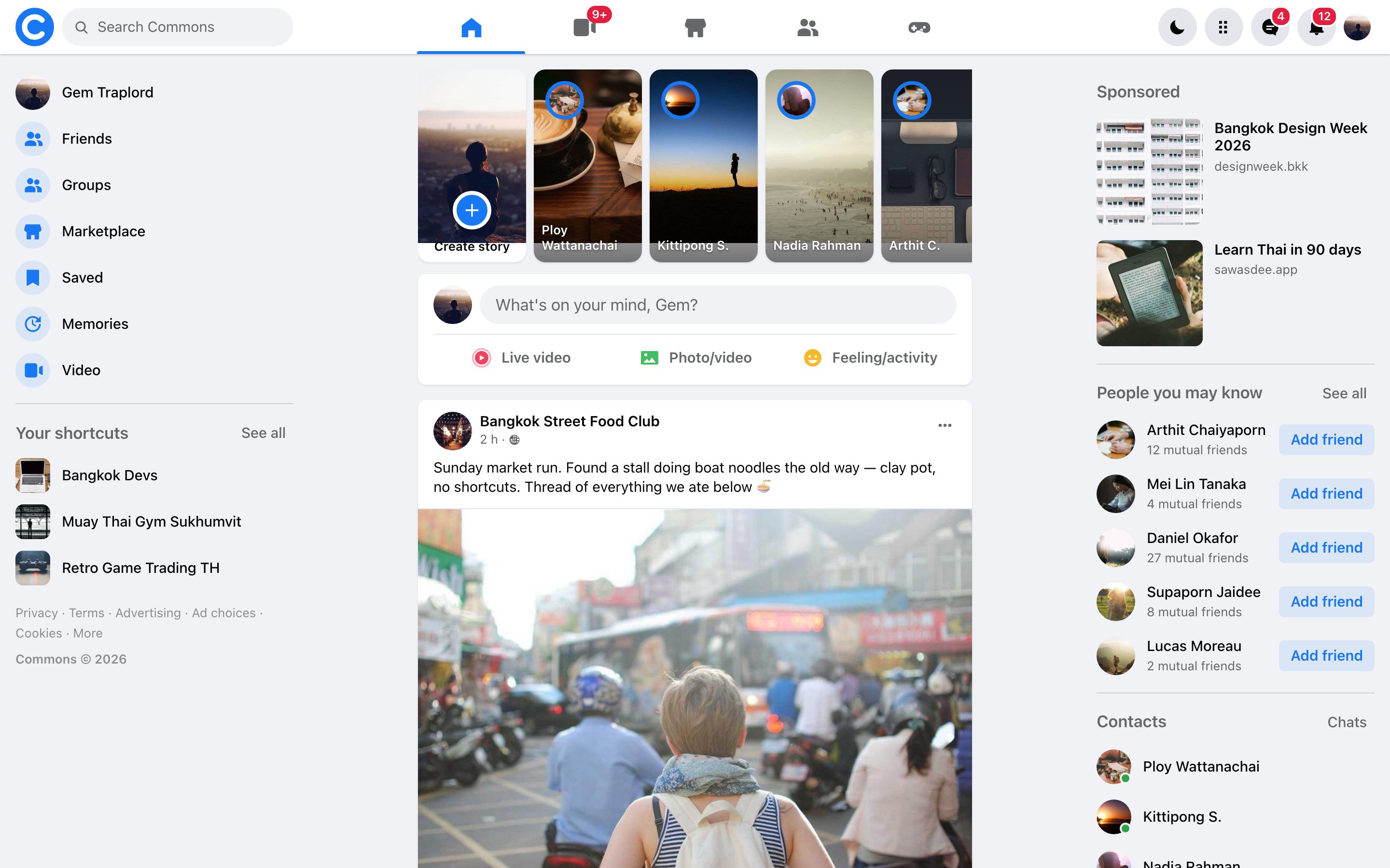
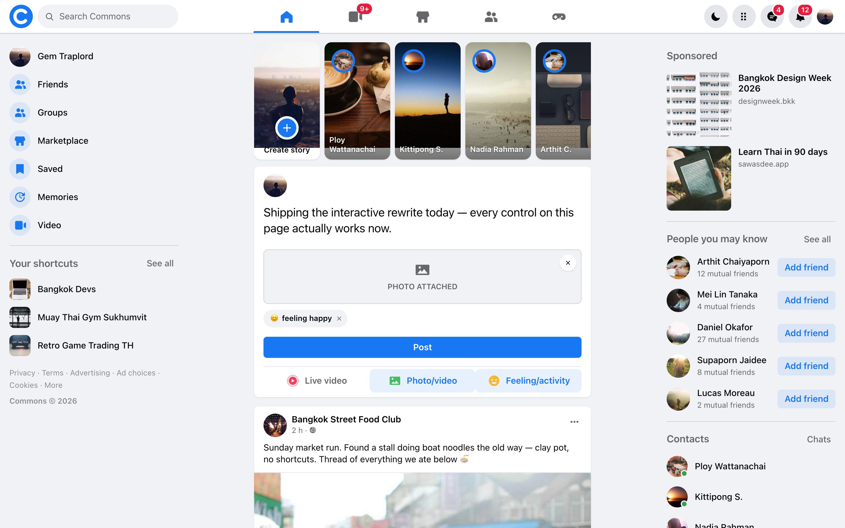
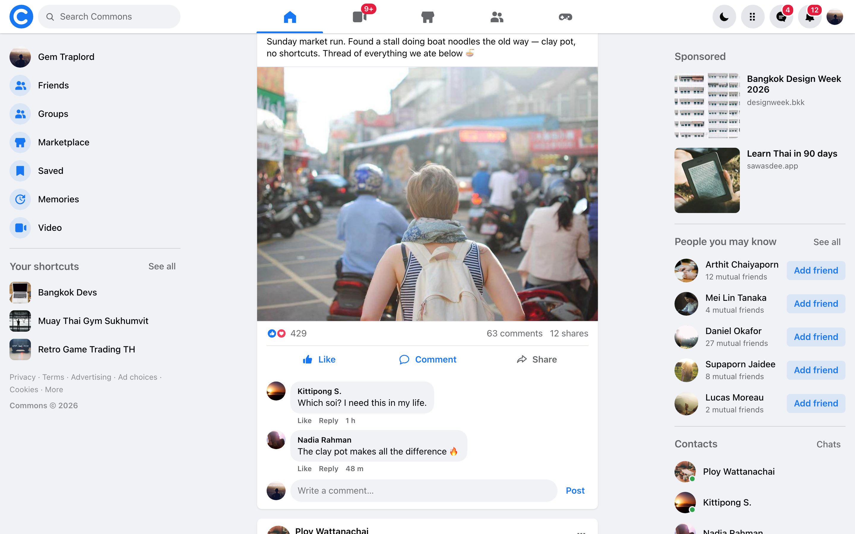
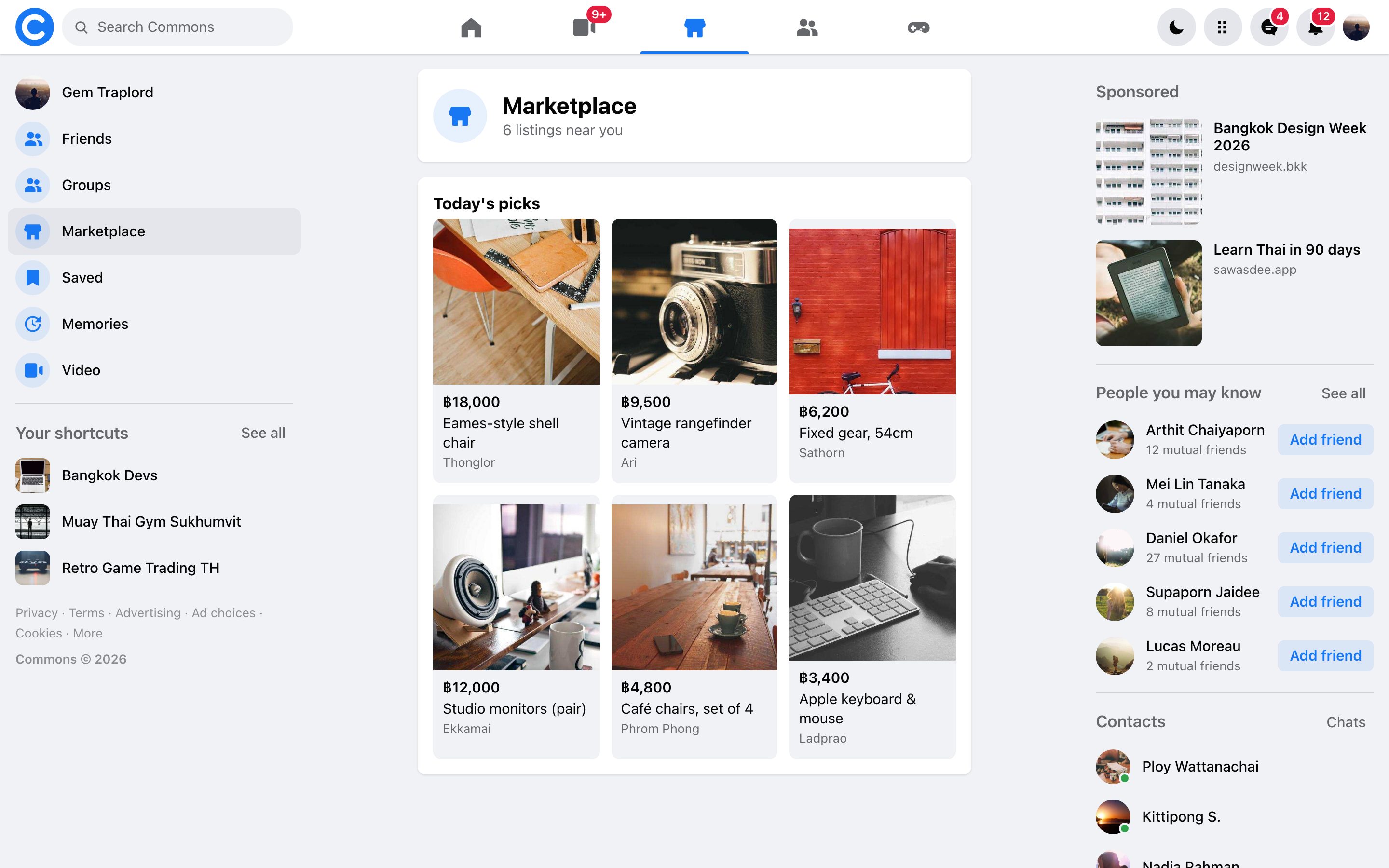
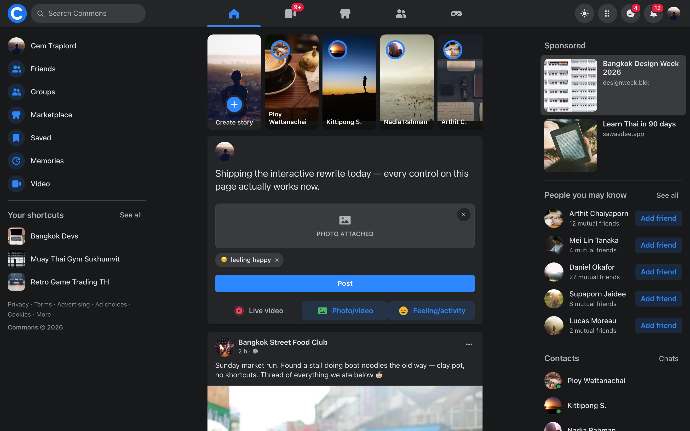
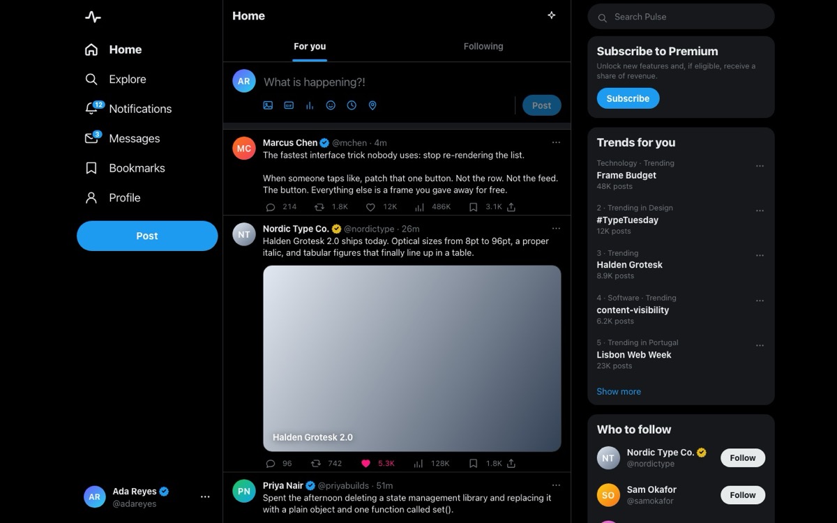
Commons is the classic social network layout rebuilt as a working product, not a screenshot with dead buttons. A sticky navbar with search and badge counters sits over the three-column grid. Both rails are position-fixed and hold still while the news feed scrolls between them. The composer expands and takes a photo, a live tag, or a feeling, and posting unshifts a new object straight onto the live feed array. Every post card’s Like toggles its own colour and moves its own counter by exactly one. Comment opens a real thread, and the ⋯ menu saves, hides, or deletes with an undo. Around the feed, everything else answers too: eleven routes without a router, notification and chat popovers, a story viewer, chat windows that send and minimise, live search, and a dark theme swapped through design tokens.
Who this template is for
This build is for anyone who needs a feed: a product adding a social surface, a developer studying how a big interface stays in sync, or a student who wants the canonical layout with the wiring left visible.
- Developers who want a worked reference for the hard parts of an app shell: routing without a router, a feed that renders from one array, and chrome that stays interactive while you type
- Products that need a familiar social surface (feed, composer, reactions, and chat) with the mechanics people already know and none of the framework weight
- Anyone learning front-end state who wants to see a large interface where every control traces back to a single object, small enough to read in one file
What problem this template solves
Most product front ends you can open and read are either a framework tutorial with three fake rows in it, or a real app whose logic is buried under a build pipeline. This build is neither.
- Interface clones stop at the layout, and the mechanics that make the product work are left as an exercise
- State rules are the hard part, and they’re exactly what a screenshot can’t show you
- A build behind a bundler is a build you can’t read: the file you open isn’t the code that runs
What you get with this template
One index.html. Open it and the whole application runs, with no install, no bundler, no server, and no network requests.
- The full app shell: a sticky navbar with search and live badges, both fixed rails, eleven routes, popovers, a story viewer, a photo lightbox, and dockable chat windows
- The whole feed pipeline: an expanding composer with photo, live, and feeling attachments whose draft survives route changes, posts that unshift onto the live array, and per-post like, comment, share, save, hide, and delete
- The sync mechanics in readable code: one state object, one delegated click handler, class-toggle chrome updates that never steal focus, and a dark theme swapped entirely through CSS custom properties
Page sections overview
| Section | Purpose |
|---|---|
| The fixed frame | A navbar that sticks and rails that hold still. |
| The composer | A draft object, not a form. |
| The like rule | Each card owns its state. |
| The routes | Eleven views and no router. |
| The sync layer | Every surface derives its state. None of them toggle it. |
Design and branding system
The design brief was fidelity: the real product’s tokens, hierarchy, and spacing, reproduced closely enough that the differences are the interesting part.
- The authentic palette as CSS custom properties (ground grey #F0F2F5, card white, text at three weights, and the one blue #1877F2), with the whole dark theme expressed as a second token set on a single html attribute
- The same hierarchy: a 590px feed column, a 56px navbar, and avatar sizes and divider weights measured from the product instead of guessed
- System-native type and flat cards with the product’s own shadow recipe, so the page reads as the real thing at a glance and as a clean study up close
Mobile and speed optimization
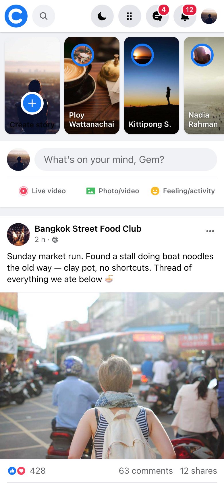
The layout is designed at full width and then composed down, so the same interface holds together on a phone without a separate mobile build.
- The multi-column grid collapses in stages, so each breakpoint has a deliberate layout
- Touch targets, type, and spacing are re-tuned at the small end instead of just shrinking
- Nothing overflows sideways at any width, and that’s checked by measurement
How this template helps you convert
A working product beats a mockup. The page is arranged so a visitor can use the thing before deciding anything.
- Visitors use it right away, because the live build is on the page with no signup or install in the way
- Every mechanic is inspectable, which turns a curious visitor into someone who wants the brief behind it
- Paying once for the prompt is a concrete next step while the product is still open in the tab
Other information about this template
A few more details to know before you build on this template.
- Zero network requests: avatars and imagery are generated gradients, the icon set is an inline SVG sprite, and the favicon is a data URI
- Keyboard support throughout. Every control is a real button with a visible focus ring. Escape unwinds the overlay first, then the menu, then the popover. Enter sends and Cmd/Ctrl+Enter posts
- Shipped as a study of the interface. For production use, reskin the mark and palette to your own brand the way the prompt’s restyle option describes
The sync layer
One state object is the only source of truth, and every surface derives from it. Navigate to Marketplace from the nav tab and the left-rail item lights up too, because both read the same route field rather than toggling themselves. Add a friend in the right rail and the Friends page already says Requested. The section headings are buttons (“Sponsored”, “Contacts”, and a post author’s name), and all of them route through the same one-line go() call.
Two bugs worth buying
The post ⋯ menu is anchored in document space instead of viewport space. A fixed-position menu detaches from its post on the first scroll event, which can fire asynchronously the same instant the menu opens and close it before it’s seen. And the chrome never re-renders as HTML. Active tabs and badges change by class toggle, so the search input keeps focus and caret while you type. Both are the kind of defect that passes code review and only appears in a driven browser.
Screenshots
Captured from the live build, section by section, exactly as the template renders.